On 22nd January, the JRAAS team facilitated a workshop within the context of the 2nd FLUP Research Meeting, called “Mapping Utopias: Introduction to Map-making in R”. Our workshop was based on the work done by myself and Joana Pinela for the article we published on the latest issue of Via Panoramica, analysing the Utopia 500 “Great Utopians” collection.
Our participants represented a plethora of backgrounds within the Humanities, including Literature, Cultural Studies and Geography. One thing united them: they all found that constructing interactive maps was relevant to the work that they were doing.
The workshop was envisioned as an introduction to R and to the process of creating and reproducing map visualizations using R-language on R-studio. The learning goals we set out for participants were:
- Creating a map visualization on R-studio;
- Editing the script, so that participants might change the look of the visualization according to their liking;
- Understanding basic concepts of R language (such as creating objects and exploring databases) and mapmaking (like dealing with coordinates in specific map projections).
Theoretically, we based the workshop on the specific notions a researcher must have when working with cartography - that, whenever we are making a map, we need to be aware of the fact that mapmaking necessitates the loss of information, because we only pick relevant information based on what the objective of the map is. To illustrate this, we shared the Jorge Luis Borges short story called “On the Exactitude of Science”, which explores an imaginary empire where the art of cartography is so extremely precise that, eventually, cartographers construct a map that covers the entirety of the territory to faithfully depict the geography of the empire, making it essentially useless. After all, a map that illustrates the entirety of information afforded by reality becomes useless.
This is the context in which Drucker’s idea of data and capta becomes relevant. The information we are given cannot simply be understood as a preorganized set of data; rather, we always process it through interpretation, changing its form into whatever is necessary for the work we’re doing, meaning that data (that which is given) in this context is actually capta (that which is taken). You can read further about Johanna Drucker’s conceptions of data and capta here.
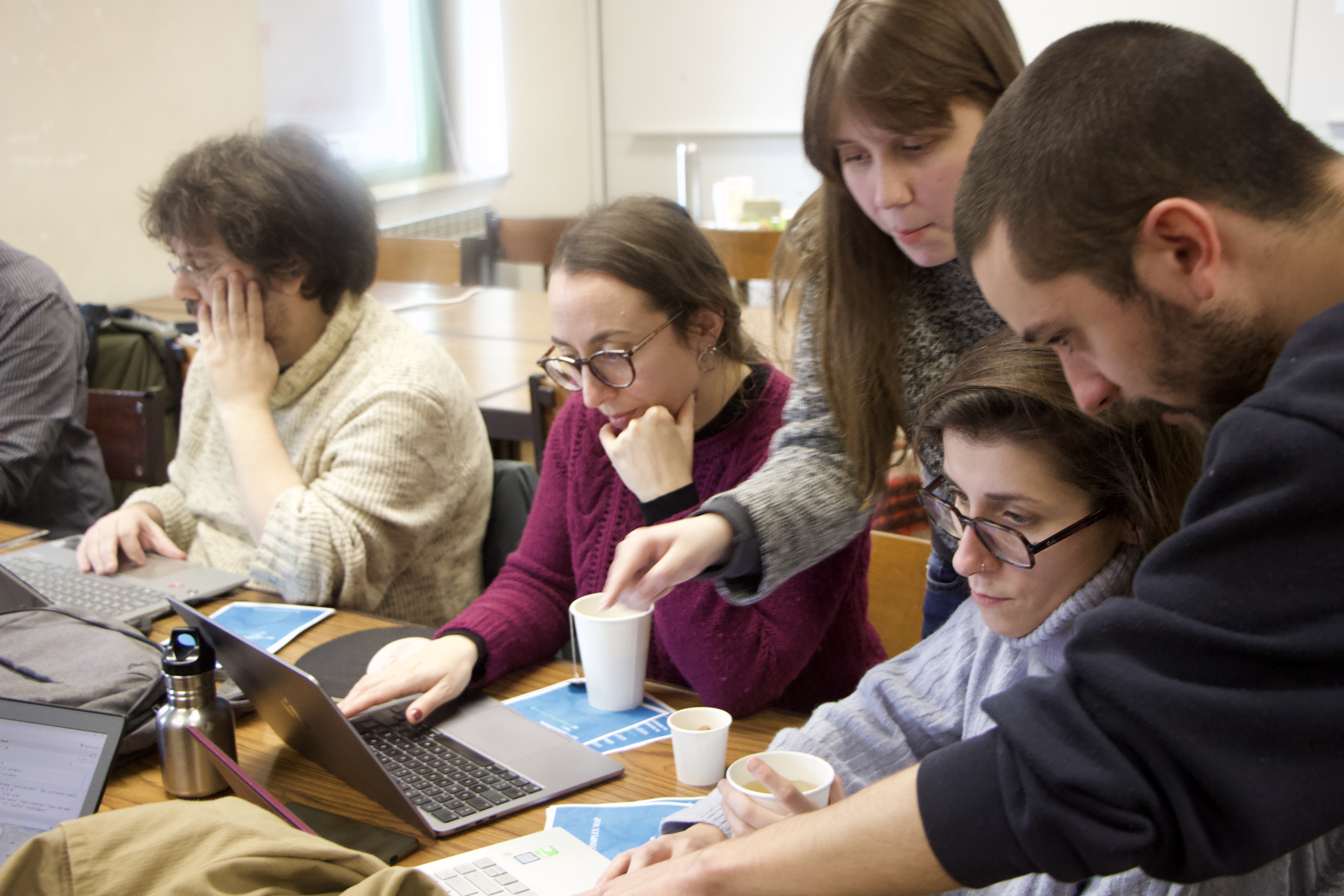
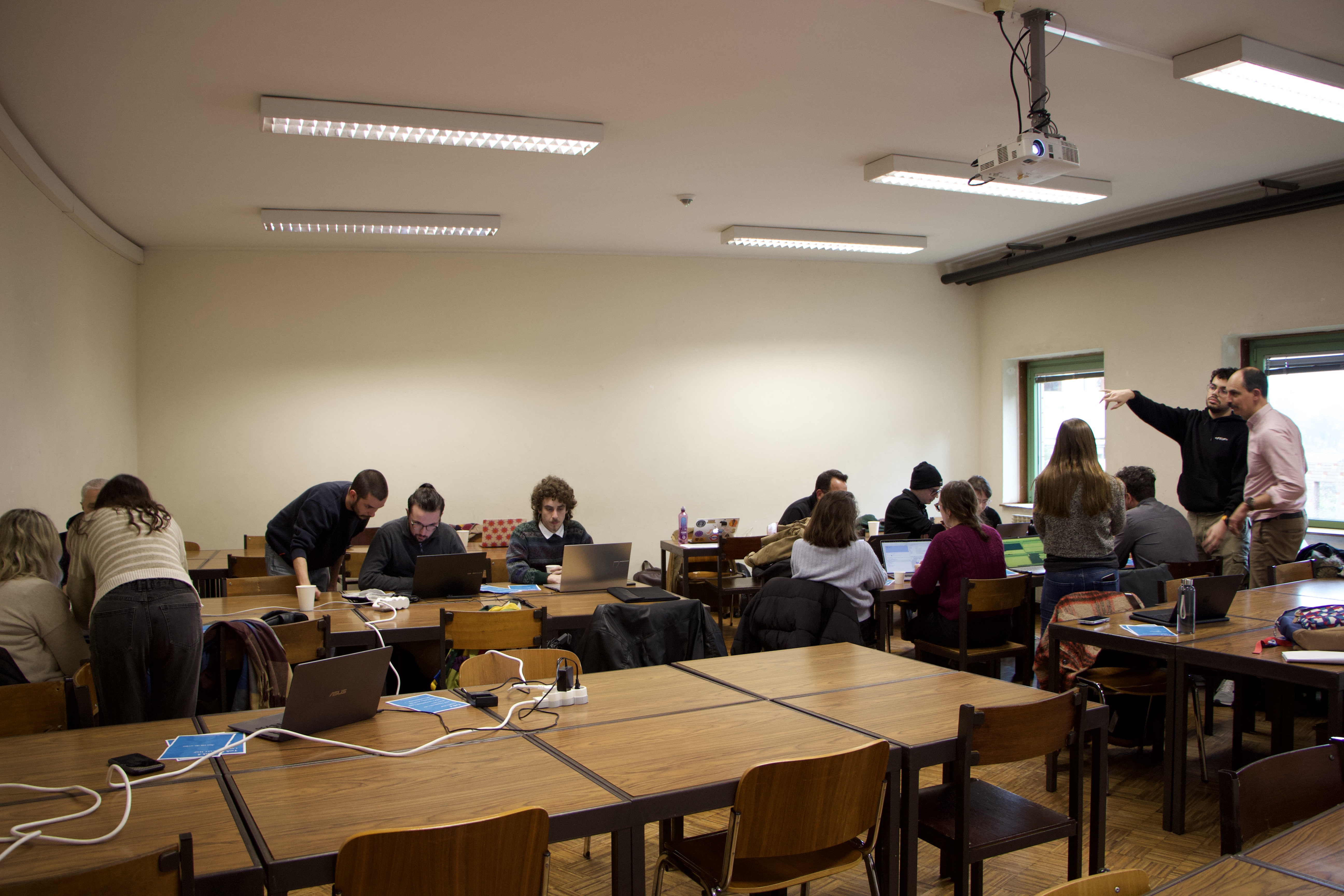
We had twelve participants, which we organized in two groups, not only to ease the workload on us, but also to foster communication and mutual aid between participants. We also prepared tea and snacks; this was an attempt to combat the problem that arises in a lot of workshops, of turning the activity into a sort of class or lecture. We wanted to foster a friendly and inviting environment where people felt at ease to learn by themselves, and not one where we assumed the role of a lecturer in a classroom.
The workshop was designed on a matrix of increasing complexity. We conducted a brief introduction to the R-studio environment, in which we showed participants the structure of the software and how to operate very simple functions, to offer a behind the scenes look into our main tool. We then analysed the database we constructed without the aid of map visualizations, exploring the variables of gender, field and geographical origin of the entries.
Afterward, we picked up the only three Portuguese entries of the database and created a very simple map, in which the popups only had the entries’ names.
Once that was done, we inserted the entire database in our map, with all variables displayed on the popup, and we then went into changing the look of the visualization by changing the script. The last step in our workshop was to run a script which would create a visualization where the specific variable of gender could be examined by assigning differently colored markers for male and female entries (we have actually showcased this visualization in a previous post).
After each visualization accounting for the entire database, participants were encouraged to discuss what conclusions they could reach by looking at the maps. Our participants were quick to notice the overwhelming dominance of European and North American entries and the underrepresentation of women (which were aspects that we analysed in our Via Panoramica article). Yet, novel and thought provoking analyses also arised. For example, one of the participants superimposed a railway map of the world on our “Great Utopians” map, and noticed that the overwhelming majority of entries had been born near railways, which may indicate that there is a tendency for utopians to be associated with urban and industrialized spaces.
Seeing that our participants reached these conclusions was, to us, a sign that our workshop reached its ultimate goal. We wished to show potential researchers in the humanities that a tool such as R was useful in offering new perspectives that had the potential of leading research work into uncharted territory that would be much harder to reach without the aid of digital tools. This is, in essence, the core of the Digital Humanities: to use modern digital tools insofar as they help us reach the previously unexplored.